Post-War to Digital Revolution: Mid-Century and Beyond
From the Graphic Art History curriculum
TL;DR
This era dramatically transformed graphic design from print-focused to screen-based, driven by new technologies and a changing society. Design moved towards clean, functional aesthetics in the mid-century, then exploded with expressive and digital innovation. Understanding these shifts helps you see how contemporary graphic art evolved.
1. The Mental Model
Think of this period as a rapid acceleration in graphic design. It started with established printing methods but quickly integrated new technologies, evolving from static paper designs to dynamic digital experiences, constantly reacting to and shaping culture.
2. The Core Material
The period from post-World War II to the Digital Revolution saw graphic design undergo profound changes, influenced by economic booms, new technologies, and cultural shifts.
Mid-Century Modernism (1945-1960s)

Photo by 幻影 多媒体 on Pexels
After WWII, there was a drive for clarity, order, and functionality. This led to International Typographic Style (Swiss Style), characterized by:
* Grid systems: For organized, clear layouts.
* Asymmetrical layouts: Dynamic balance over static symmetry.
* Sans-serif typefaces: Like Helvetica and Univers, for legibility and neutrality.
* Objectivity: Focus on conveying information clearly, often with photography.
* Minimalism: "Less is more" was a core principle.
Influential designers included Josef Müller-Brockmann and Paul Rand, who applied these principles to corporate identity, advertising, and editorial design, making complex information accessible.
Pop Art and Psychedelic Design (1960s-1970s)
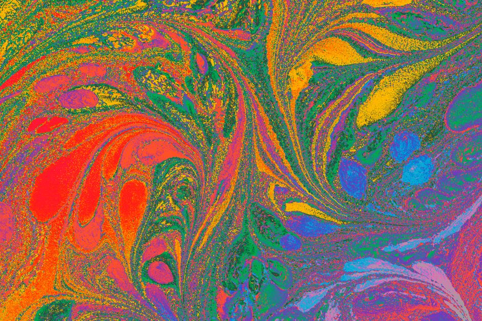
Photo by Turgay Koca on Pexels
As society reacted to the austerity of mid-century modernism, graphic design became more expressive and rebellious.
* Pop Art: Reacted against abstract expressionism, drawing inspiration from popular culture, advertising, and comic books. Bright colors, bold imagery, and appropriation were common. Andy Warhol and Roy Lichtenstein influenced graphic artists significantly.
* Psychedelic Design: Emerged from the counter-culture movement, particularly in music posters. It featured distorted letterforms, vibrant and clashing colors, complex patterns, and organic shapes, aiming to evoke the hallucinatory experience. Designers like Wes Wilson became iconic.
Postmodernism and New Wave (1970s-1980s)

Photo by Brett Jordan on Pexels
Challenging the universal truths and rigid rules of modernism, postmodernism embraced eclecticism, irony, and deconstruction.
* New Wave: A graphic design movement that emerged in the late 1970s, partly as a rebellion against strict Swiss Style. It introduced diagonal lines, fragmented type, layered elements, and a more playful, less rigid use of grids. Wolfgang Weingart is a key figure.
* Punk Graphics: Raw, DIY aesthetic, often using collage, distressed typography, and photocopied imagery to convey a sense of rebellion and anti-establishmentarianism.
Early Digital Revolution (1980s-1990s)

Photo by Ruben Boekeloo on Pexels
The introduction of personal computers (like the Apple Macintosh in 1984) and software (like Aldus PageMaker and Adobe Photoshop) revolutionized design.
* Desktop Publishing (DTP): Empowered designers with unprecedented control over type, image, and layout, moving production in-house.
* New aesthetics: Early digital tools often led to a distinctive look, sometimes characterized by pixelated imagery, limited color palettes, and the exploration of new digital effects. Designers like April Greiman pushed these boundaries, creating work that was unmistakably digital.
* Shift from physical to digital: The design process increasingly moved from drafting tables and darkrooms to computer screens.
Here's a diagram showing the key influences and shifts:
graph TD
    A["Post-WWII Context (Order, Clarity)"] --> B["Mid-Century Modernism (Swiss Style)"]
    B --> C["Corporate Identity, Grids, Sans-serifs"]
    A --> D["Social Rebellion, Consumer Culture"]
    D --> E["Pop Art (Mass Media, Bright Colors)"]
    D --> F["Psychedelic Design (Counter-Culture, Distortion)"]
    C --> G["Reaction Against Modernist Dogma"]
    E --> G
    F --> G
    G --> H["Postmodernism (Irony, Eclecticism)"]
    G --> I["New Wave (Broken Grids, Layering)"]
    H --> J["Personal Computers, DTP Software"]
    I --> J
    J --> K["Digital Revolution (Pixel Art, Screen Design)"]
    K --> L["Contemporary Graphic Art (Web, UI/UX)"]
3. Worked Example
Imagine you're designing a concert poster for a band in 1968. Instead of the clean, grid-based layout of a Swiss Style poster for, say, a business conference, you'd lean heavily into psychedelic elements. You'd choose a vibrant, almost clashing color palette (like electric blues, neon greens, and hot pinks). The band's name might be rendered in highly decorative, undulating, or stretched letterforms that are hard to read at first glance but visually captivating. Images of swirling patterns or distorted figures could be integrated. This starkly contrasts with a Paul Rand corporate logo from the same period, which would be precise, minimalist, and instantly recognizable. The difference isn't just aesthetic; it reflects the cultural values and intended audience of each piece.
4. Key Takeaways
- Mid-century modernism emphasized clarity, order, and functionality through grid systems and sans-serif typefaces.
- Pop Art and Psychedelic design introduced expressive, often rebellious aesthetics, drawing from popular culture and counter-culture.
- Postmodernism challenged modernist rules with eclecticism, irony, and experimental typography.
- The advent of personal computers and desktop publishing dramatically shifted the tools and possibilities for graphic designers.
- Each era's design principles were deeply intertwined with prevailing social, cultural, and technological conditions.
-
Understanding these movements helps contextualize contemporary design choices and trends.
-
Common Mistakes to Avoid:
- Don't confuse minimalism (like Swiss Style) with digital simplicity; they have different origins and often different goals.
- Avoid thinking of these movements as strictly linear; influences often overlapped and reacted to each other.
- Don't underestimate the impact of printing technology (or its limitations) on design choices before the digital era.
- Don't assume all "modern" design is the same; "modernism" as a movement has distinct characteristics different from general "modern" aesthetics.
5. Now Try It
Choose a contemporary brand (e.g., a coffee shop, a tech startup, or a music festival). Design two simple logo concepts for it: one strongly influenced by Mid-Century Modernism (think clear, simple, geometric, sans-serif) and another by New Wave/Postmodernism (think layered, slightly fragmented, perhaps more experimental typography, less rigid grid). Spend about 15 minutes sketching or digitally mocking up these two distinct approaches.
Success looks like: You can clearly articulate why each logo concept fits its chosen era's aesthetic principles, demonstrating an understanding of the visual language of both periods.
Frequently asked about Post-War to Digital Revolution: Mid-Century and Beyond
Study this next
Get the full Graphic Art History curriculum
Clone the complete plan to your dashboard for unlimited AI-generated notes, practice quizzes, and a personalised revision schedule.
Save this course free