Statistical Thinking and Data Analysis
From the mathematics in the modern world curriculum
Statistical Thinking and Data Analysis
TL;DR
Statistical thinking helps you make sense of data and draw reliable conclusions in a world full of numbers. You'll learn to ask the right questions, collect and organize data, and interpret results carefully. This approach helps you avoid common pitfalls and make better decisions based on evidence.
1. The Mental Model
Think of statistical thinking as learning to be a data detective. You're not just looking at numbers; you're using them to uncover patterns, test ideas, and find answers to real-world questions, all while being skeptical and aware of potential biases.
2. The Core Material
Statistical thinking isn't just about formulas; it's a way of approaching problems with data. It involves a cycle of understanding the problem, collecting data, analyzing it, and then interpreting what you've found.
Defining Your Question

Photo by Ann H on Pexels
Before you even look at data, you need a clear, specific question. A vague question leads to vague answers. For example, instead of "Are people happy?", ask "What's the average job satisfaction rating (on a scale of 1-5) among employees at Company X?"
Data Collection: Getting Good Information

Photo by Markus Winkler on Pexels
Once you have your question, you need data. How you get it is crucial.
- Observation: Simply watching and recording without interfering. Example: Counting how many cars pass a certain intersection in an hour.
- Experimentation: Actively manipulating one or more variables to see the effect on another. Example: Giving one group a new fertilizer and another group a standard one to compare plant growth.
- Surveys: Asking people questions. Requires careful wording to avoid bias. Example: A poll asking about preferred political candidates.
The quality of your data directly impacts the quality of your conclusions. Be aware of bias – systematic errors that make your data unrepresentative. For example, asking only your friends about a new product might give you a skewed view because they might be more likely to agree with you.
Organizing and Summarizing Data
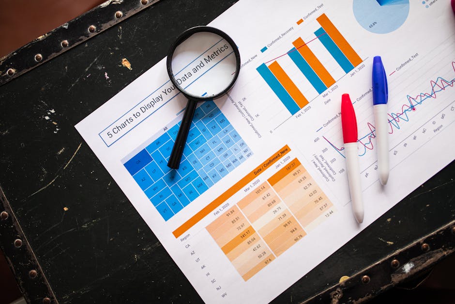
Photo by RDNE Stock project on Pexels
Raw data is often messy. You need to organize it to see patterns.
- Categorical Data: Data that can be grouped into categories (e.g., favorite color, gender, type of car).
- You can count frequencies (how many times each category appears) and calculate percentages.
- Numerical Data: Data that represents quantities (e.g., age, height, income).
- Measures of Central Tendency: These tell you the "middle" or "typical" value.
- Mean: The average (sum of all values divided by the count).
- Median: The middle value when data is ordered (half values are above, half below).
- Mode: The most frequent value.
- Measures of Spread/Variability: These tell you how spread out your data is.
- Range: The difference between the highest and lowest values.
- Standard Deviation: A common measure of how much individual data points deviate from the mean. A small standard deviation means data points are close to the mean; a large one means they're spread out.
- Measures of Central Tendency: These tell you the "middle" or "typical" value.
Visualizing Data

Photo by Google DeepMind on Pexels
Graphs and charts help you see patterns that numbers alone might hide.
- Bar Charts: Good for comparing categorical data.
- Histograms: Show the distribution of numerical data (how often values fall into certain ranges).
- Scatter Plots: Show the relationship between two numerical variables.
graph TD
    A["Formulate Clear Question"] --> B["Plan Data Collection (Sampling, Ethics)"]
    B --> C{"Collect Data"}
    C --> D{"Organize & Clean Data"}
    D --> E["Summarize & Visualize Data"]
    E --> F{"Interpret Results (Patterns, Relationships)"}
    F --> G["Draw Conclusions & Communicate Findings"]
    G --> A;
Interpretation and Inference
This is where you make sense of your organized data. You look for trends, relationships, and deviations.
- Correlation vs. Causation: Just because two things happen together (correlation) doesn't mean one causes the other (causation). For example, ice cream sales and shark attacks both increase in summer, but ice cream doesn't cause shark attacks.
- Sampling Error: When you take a sample from a larger population, your sample might not perfectly represent the whole population. This is natural, but understanding its impact is key.
- Statistical Significance: If you find a pattern, how likely is it that you found it just by chance? Statistical tests help you quantify this likelihood. If something is "statistically significant," it means it's unlikely to have happened by random chance.
3. Worked Example
Let's say you're a small business owner and want to know if a new advertising campaign increased your website traffic.
-
Question: Did our new social media ad campaign (launched last month) significantly increase daily website visitors compared to the month before?
-
Data Collection: You access your website analytics.
- Data for "Month Before Campaign": Daily visitors for 30 days.
- Data for "Month During Campaign": Daily visitors for 30 days.
-
Organize & Summarize (Simplified Example):
- Month Before: (Let's say daily visitors were: 80, 85, 75, 90, 82, 78, 88, 92, 79, 81, ..., average = 84 visitors/day)
-
Month During: (Let's say daily visitors were: 100, 105, 98, 110, 102, 95, 108, 112, 99, 101, ..., average = 103 visitors/day)
-
Calculations:
- Mean (Before): 84 visitors/day
- Mean (During): 103 visitors/day
- Range (Before): Max 92 - Min 75 = 17
- Range (During): Max 112 - Min 95 = 17
-
Visualize: You might create two histograms (one for each month) or a time-series line graph showing daily visitors over both months to visually compare the trends. You'd likely see the line jump up after the campaign started.
-
Interpret & Conclude: The average daily visitors increased from 84 to 103. This is a noticeable increase of 19 visitors/day. While a more advanced statistical test (like a t-test) could tell you if this difference is statistically significant (i.e., not just due to random daily fluctuations), the preliminary look strongly suggests the campaign had a positive impact. You'd conclude that based on the data, the campaign likely increased website traffic.
4. Key Takeaways
- Start with a clear, specific question before collecting any data.
- Understand the type of data you're working with (categorical or numerical) to choose appropriate analysis methods.
- Always consider potential biases in how data was collected, as it can skew your conclusions.
- Visualizing data with charts like histograms or bar graphs reveals patterns more easily than raw numbers.
- Be cautious about assuming causation; correlation only means things move together.
- Statistical significance helps you determine if observed patterns are likely real or just due to chance.
- Don't just report numbers; interpret what they mean in the context of your original question.
5. Now Try It
Think of a question you have about something in your daily life – maybe about your study habits, local weather, or spending. Define a clear, specific question, brainstorm how you would collect data for it (even if you don't actually collect it), and identify what kind of data it would be (categorical or numerical). Then, consider what measures (like mean, median, range, or counts) would be most useful to summarize it, and what type of chart you'd use to visualize it. What would success look like for your investigation?
Frequently asked about Statistical Thinking and Data Analysis
Study this next
Get the full mathematics in the modern world curriculum
Clone the complete plan to your dashboard for unlimited AI-generated notes, practice quizzes, and a personalised revision schedule.
Create Free Account